Motorola Edge 20 Pro review: filling a void

There is a OnePlus-sized void waiting to be filled in the flagship killer space and buyers looking for a performance-first device with a near-stock Android experience will be hard-pressed for choices. I say this, because the company recently merged the code base for OxygenOS with OPPO’s ColorOS, a decision that might not sit too well with smartphone enthusiasts. Thankfully, there is light at the end of the tunnel. Motorola recently came up with the Edge 20 Pro smartphone which has all the makings of a compelling flagship killer – it is backed by an 8-series Qualcomm processor, ships with stock Android interface and offers a gorgeous OLED display. So then, is the Edge 20 Pro a good buy, or should you look elsewhere? Let’s find out in this review.
Table of Contents
Verdict
The Motorola Edge 20 Pro checks a lot of boxes. However, the handset is caught between two fires and struggles to make its mark, seeing how buyers can spend less and get similar performance with the iQOO 7, or step up to more well-rounded devices like the Mi 11X Pro.
Design
Motorola is no stranger to good-looking phones. Be it the Moto X4 (review) that launched a few years ago or the revamped foldable Razr 5G, the brand has a penchant for making quality handsets that cut a dash. The Edge 20 Pro looks exquisite too and comes toting an all-glass design with a matte finish on the back. The company has also etched a dot-matrix pattern on the phone’s back which gleams under the sun, albeit is restricted towards the edges of the frame. I quite like this approach as it adds just the right amount of panache to the phone’s otherwise humdrum design.
I should add that the finish is prone to smudges, though the matte coating ensures the stains aren’t too discernable or distracting. On the bright side, the smartphone ships with a sleek aluminium rail which adds to the luxurious in-hand feel. The device doesn’t feel top-heavy either and despite the use of premium materials like glass, tips the scales at just 190g, which is great. All things considered, the Motorola Edge 20 Pro is among the better-looking phones in the sub Rs 40K segment.
Unfortunately, the smartphone’s design is not without its faults. In fact, of all the phones I’ve reviewed this year, the Motorola Edge 20 Pro takes the cake for the phone with the most inconveniently placed buttons. To that note, the power button has been positioned towards the top, as opposed to the middle of the frame. Now, bear in mind that the Edge 20 Pro is not a compact phone by any stretch of the imagination and the device ships with a massive 6.7-inch screen.
Now, while I would’ve been content with tapping on the display to wake the screen, Motorola has embedded the fingerprint sensor inside the power button. So, I had to reluctantly stretch my thumb whenever I wanted to unlock the phone. Making matters worse, the handset’s volume toggles have been positioned even higher. And, while you do get a dedicated Google Assistant key on the phone’s left-hand spine, the button has been positioned awkwardly high up the frame too. Rest assured, you’ll almost always have to use the Edge 20 Pro with both hands. Disappointingly enough, the handset’s camera bump makes the device wobble when laid on a flat surface as well.
Now, credit where credit’s due, the handset’s fingerprint sensor worked really well and I seldom had to tap it twice to register input to unlock the phone. Moreover, the smartphone’s facial unlock is serviceable too, at least during the day. Unfortunately, the device’s audio setup leaves a lot to be desired. For one, the handset doesn’t ship with a headphone jack, which is a bummer. Furthermore, the device ships with a mono-firing speaker which might not bode well with prospective buyers either, given how competing brands offer a dual-speaker setup with their offerings.
Display
The Motorola Edge 20 Pro ships with an OLED display that measures 6.7-inches and offers FHD+ resolution. What’s more, the panel can refresh at 144Hz, ensuring in-app animations and UI transitions are rendered smoothly on the device. Notably, unlike its predecessor, the Edge 20 Pro doesn’t ship with a curved display and I am all for it. The reason being, a flat display keeps accidental touches at bay and in my experience, offers superlative palm rejection too. The panel also touts a peak brightness of 700 nits, so you shouldn’t worry about using the phone when it’s sunny outdoors.
Coming back to the matter at hand, the Edge 20 Pro’s display is a thing of beauty and the panel offers punchy colours, excellent viewing angles and deep blacks. What’s more, the smartphone comes with WideVine L1 certification too and per the company, the panel is compliant with HDR 10+ media as well. Unfortunately, I couldn’t relay HDR streams via OTT services like Netflix but despite that, I thoroughly enjoyed consuming media on the Edge 20 Pro’s screen – the visuals appeared crisp and the colours felt life-like. Speaking of which, unlike most phones, the Edge 20 Pro ships with a 10-bit panel, meaning it can relay a wider gamut of colours as opposed to phones that ship with an 8-bit screen.
I also had a fantastic time playing games on the phone’s screen. For one, the 6.7-inch display was plenty accommodating for my pudgy fingers. Moreover, the panel ships with a punch hole notch which barely takes up any space on the screen. More importantly, the device offers a touch sampling rate of 576Hz – let that sink in for a minute. Unsurprisingly, the panel picked up on all my finger gymnastics seamlessly, thereby elevating my gaming experience tenfold.
Cameras
The Edge 20 Pro is quite possibly, Motorola’s most ambitious camera phone to date. Spec-wise, the smartphone ships with a 108MP main sensor that works alongside an 8MP, 5x periscope telephoto lens, a 16MP ultrawide angle shooter and a 32MP selfie camera. For anyone curious, the main camera makes use of Samsung’s HM2 sensor, whereas the rest of the shutters employ OmniVision sensors.
Coming to the picture quality, the Edge 20 Pro’s primary sensor reciprocates colours in a scene well. While I wouldn’t dub the snaps colour-accurate, the handset’s post-processing isn’t too over the top either and consequently, you’ll be greeted with pleasant, vivid hues whenever you press the shutter button. That said, I wasn’t quite sold on the handset’s sensor details and at a closer crop, the objects in the frame would appear oversharpened. Moreover, the handset’s dynamic range isn’t the best and the sensor would, at times, struggle to bring out the details in the shadows.
You do get bountiful details when snapping images at 108MP resolution, though the colours in the frame appear more saturated compared to their pixel-binned counterparts. The wide-angle sensor captures passable photos with good detail retention around the centre of the frame too. However, the corner details leave a bit to be desired.
Similarly, the smartphone’s telephoto sensor isn’t the sharpest zoom sensor in the biz and the 5X snaps would often appear a tad soft. A good example of the same is the shot of the pink building wherein, you’ll notice that the edges of the windows aren’t all that well defined. On the flip side, the unit’s 32MP selfie shooter clicks gorgeous photos with realistic skin tones, ample background details and sharp textures. That said, I wasn’t quite convinced with the portrait images from the front camera as the blur effect would creep into the bits in focus.
In a similar fashion, the Motorola Edge 20 Pro’s lowlight photos were not up to the mark. While the handset could improve the visibility in images with the night mode enabled, the resulting composition had too much noise in it. Furthermore, the objects in the frame lacked proper definition too.
Performance and Software
The Edge 20 Pro is backed by Qualcomm’s Snapdragon 870 processor. The SoC works alongside 8GB of LPDDR5 memory and 128GB of built-in UFS 3.1 storage. Going by the specs, you’d be wise to assume that the handset can hold its own in the performance department. To give you a better picture, the device scored over 7 lakh points in Antutu benchmark, and netted over 3K points in GeekBench’s multi-core test as well. The handset’s AndroBench scores were on par with the competition too, with the phone yielding sequential read and write speeds north of 1,600MB/s and 700MB/s respectively.
Synthetic tests aside, the smartphone’s day-to-day performance didn’t leave me wanting for more either. Ergo, apps opened swiftly, animations appeared buttery smooth on the phone’s screen and the device could comfortably keep a handful of services in memory too. The smartphone’s gaming performance was stellar as well and graphically-intensive titles like BGMI and CoD Mobile could run at the highest possible graphics and frame rate presets. You can even download and run the taxing Ultra HD graphics pack for BGMI on the phone, which is great.
I’d like to add that while I didn’t notice any frame drops after gaming on the phone for extended periods, the Motorola Edge 20 Pro does get quite warm to the touch when subjected to strenuous workloads. In fact, in the CPU throttle test, the handset throttled to 77 percent of its peak performance. In contrast, the iQOO 7 (which also makes use of Qualcomm’s Snapdragon 870 chip) throttled to just 82 percent of its max performance – clearly, the Edge 20 Pro’s sleek chassis struggles to dissipate heat properly.
Motorola has for long, offered a vanilla Android experience with its devices. The Edge 20 Pro is no exception and the device ships with stock Android 11 out of the box. That said, the company has bundled a couple of customisation utilities with the interface, including Moto Styles that allows users to change the shape of icons and swap between different accent colours for various UI elements. You can also enable Peek display, which is Moto’s stupendous take on AoDs. Lest I forget, the handset offers baked-in performance-focussed utilities like RAM boost and a game mode, along with screen on and off gestures. All said and done, those pining for a no-frills Android experience will find plenty to like here. Although, I would like to see support for third-party icon packs with the interface down the line.
Battery Life and Connectivity
The Moto Edge 20 Pro ships with a 4,500mAh cell which, with the display set to refresh at 144Hz, will require a top-up before you hit the sack. That said, you could squeeze a full day’s use out of the phone with moderate usage, provided you don’t play any games or click too many photos with the device. As for charging, the device ships with a 30W brick that can charge the phone from 0-100 percent in around one hour and fifteen minutes.
Thankfully, the Edge 20 Pro leaves no stone unturned in the connectivity department. Not only is the smartphone 5G-ready, but I also got satisfactory upload and download speeds on my Airtel 4G SIM in the Delhi NCR region. Furthermore, the device also ships with added niceties like support for NFC and Wi-Fi 6, which is great.
Final Verdict
The Motorola Edge 20 Pro is not perfect, though the company’s vision holds immense promise – after all, who doesn’t like the ring of a flagship-tier handset with a stock-esque Android interface that’s void of any bloatware? To that note, the Edge 20 Pro performs well and doesn’t clog its interface with gimmicky features. The smartphone also ships with a gorgeous OLED display and charges relatively quickly too. It also helps that the device starts at Rs 36,999 in India, undercutting the likes of the iQOO 7 Legend by some margin.
That said, the Edge 20 Pro’s thermals could’ve been better and the smartphone’s cameras, while good, are certainly not the best I’ve seen south of Rs 40K. Not to mention, performance fiends will find better value in devices like the iQOO 7 (review) and the Mi 11X (review) that retail for significantly less too. So, to conclude, the Edge 20 Pro is a compelling option and buyers up in arms about custom skins will find plenty to like here. Else, you can look at some of the options I’ve prefaced above and see which one suits your preferences and budget the best.
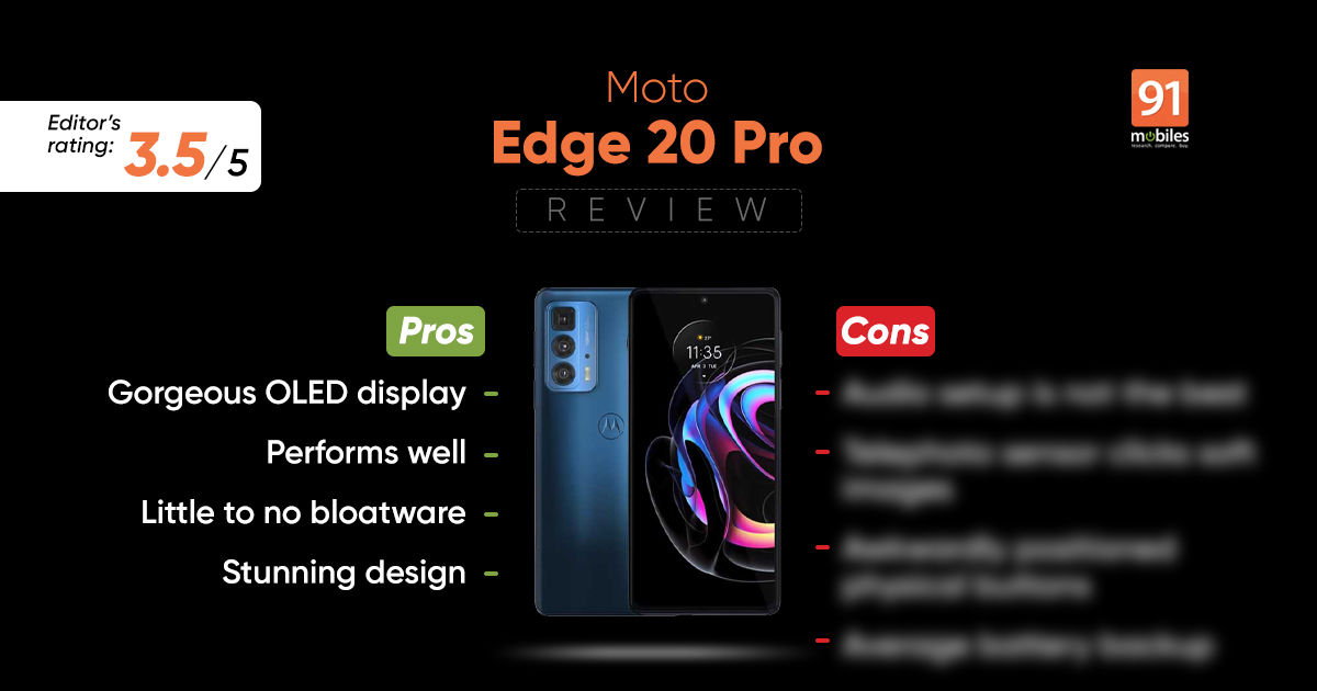
Editor’s rating: 3.5 / 5
Pros:
- Gorgeous OLED display
- Performs well
- Little to no bloatware
- Stunning design
Cons:
- Audio setup is not the best
- Telephoto sensor clicks soft images
- Awkwardly-positioned physical buttons
- Average battery backup


